PATIENT DESIGN SYSTEM
Patient.info is a website that offers healthcare content written and reviewed by healthcare professionals. It also boasts healthcare tools such as a symptom checker, which helps patients stay informed about their symptoms.
MY ROLE
TOOLS USED
User Research
UX/UI Design
Design system creation
Figma
Azure DevOps
Miro

SUMMARY
Patient.info offers a breadth of clinically reviewed content for patients and healthcare professionals. In my time on this project, I assisted in the creation and maintenance of a new, modern, WCAG-compliant design system and remapping the website navigation for user needs and clarity.
PATIENT FOR A NEW ERA
Patient.info draws in thousands of monthly users with its clinically reviewed healthcare content which is renowned in the British healthcare industry.
However, poor navigation, a broken search function, and inconsistent, inaccessible design undermined the user experience - making a full redesign essential.
THE END-TO-END PROCESS
My team and I shared responsibility for creating a new design system for Patient.info - a months-long project that required constant clear communication and transparency amongst the team through regular design stand-ups and critique sessions with the design team and stakeholders.
During this redesign, I discovered that much of the existing site failed to meet WCAG 2.2 AA standards. Components lacked sufficient contrast, keyboard navigation was inconsistent, and many images were missing alt text - posing serious accessibility barriers for users with disabilities.
I raised this during a design critique with my peers, and my team quickly worked to understand the breadth of work required to rectify this issue and soon after align with relevant stakeholders, insisting that accessibility could not be deprioritised in this project. Although it meant extending the project's timeline and delaying completion, we agreed it was essential to Patient.info’s mission of making healthcare information accessible to everyone. We wanted to work towards a polished product to work for everyone.
I led efforts to audit and tag all site images with appropriate alt text and collaborated with engineering to implement a consistent keyboard navigation pattern aligned with industry standards. We then began building new components and templates to embed accessibility into the design system moving forward.
This work ensured that the redesign wasn’t just visually modern, but also inclusive and future-proof.
THE ARTICLE HISTORY COMPONENT
I advocated for the inclusion of an article history component in the redesign, aiming to better highlight Patient.info’s key strength, its medically reviewed content. Despite the brand's strong presence in the healthcare space, I felt it wasn’t fully leveraging its clinical credibility.
After discussions with the design team and internal stakeholders, I learnt that articles undergo routine reviews based on their article type. This was an internal process that is rarely visible to users, and I set out to ensure that was no longer the case.
The component I designed prominently displays the original author(s), peer reviewers, their credentials, links to author profiles, the latest review date, and the next scheduled review date. Including the upcoming review date was especially important to reinforce Patient’s commitment to up-to-date, clinically reviewed content - one of its strongest differentiators from its competitors.
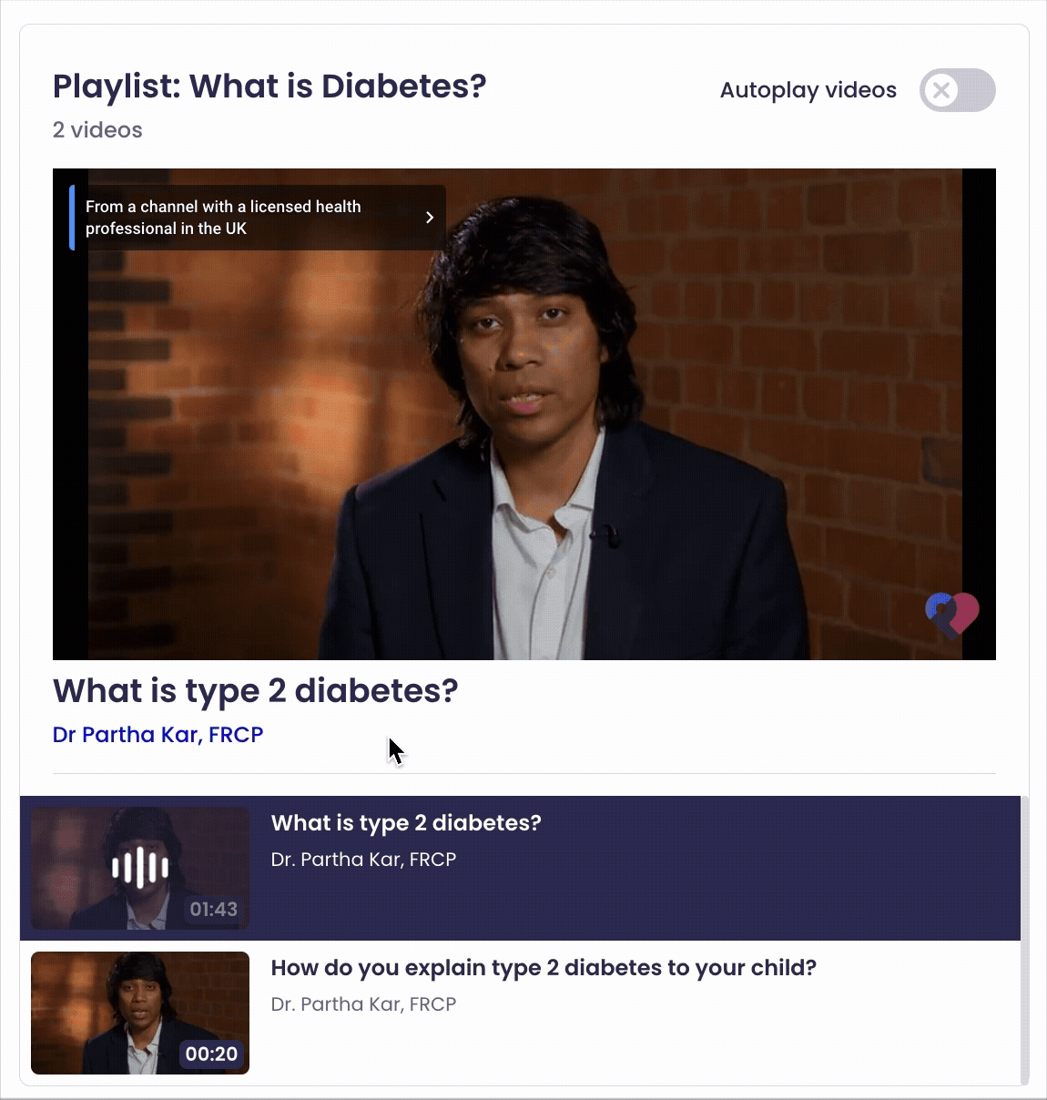
THE VIDEO PLAYLIST COMPONENT
Designing the video playlist component allowed me to deep dive into interaction design, which is something I had been eager to explore.
The existing video playlist component on Patient.info lacked clarity: users couldn't easily tell which video was playing, and titles often failed to display correctly due to technical bugs.
Drawing inspiration from platforms like Spotify, YouTube, and SoundCloud, I focused on balancing rich media data with visual clarity. Though given that I was designing components within the healthcare industry, I had to consider that video titles were often longer than other media platforms, sometimes including drug nomenclature. However, I did not want for this to compromise visual elements within the component. I felt it was important that users were able to visually pair thumbnails with text as was the industry standard across many video platforms.
To maintain clarity, I removed less essential information like descriptions and publisher names, instead showing the name of the practitioner featured in each video for added context and value to the article.
I also introduced visual cues, such as animated thumbnails for currently playing videos, and later added an "Autoplay videos" toggle based on user feedback to improve ease of use.


TO CONCLUDE,
During the ideation phase of the Patient design process, I had suggested many design ideas which could have elevated the user experience for users. Though for many reasons, some of these ideas never materialised.
One of these suggestions was the Follow Topic component, which I had suggested in early discussions. This component was designed for the signed in Patient.info experience, and allowed users to stay up to date with healthcare topics they found interesting, whether that be women's health, digestive health, ENT, etc.
It gained popularity among internal stakeholders as it could have allowed us to understand our users' interests better and suggest more relevant healthcare articles to them to improve their user experience and encourage frequent visits to Patient.info. However, due to technical limitations and team capacity, this component had to be dropped from the lineup.
Nevertheless, the Patient.info upgrade was overall a large success. User research showed the average scroll depth of Patient.info articles increased by 16%, the average bounce rate reduced by 18%, and the site rated much higher in UX heuristic evaluations.