PATIENT. INFO SEARCH ENGINE
Patient.info is a website that offers an array of healthcare content written and clinically reviewed by healthcare professionals. It also boasts efficient healthcare tools such as a symptom checker, which helps patients be informed about their symptoms.
MY ROLE
TOOLS USED
User Research
UX/UI Design
Design system creation/maintenance
Figma
Azure DevOps
Miro

SUMMARY
Patient.info provides a vast library of clinically reviewed content for both patients and healthcare professionals. Given the scale of this content, an efficient and intuitive search experience is essential, one that enables users to quickly access accurate, relevant information without friction, regardless of their medical background or device.
TRANSFORMING SEARCH RESULTS
With over 70% of users engaging with search within their first 20 minutes on Patient.info, enhancing the search experience quickly became a cross-functional priority.
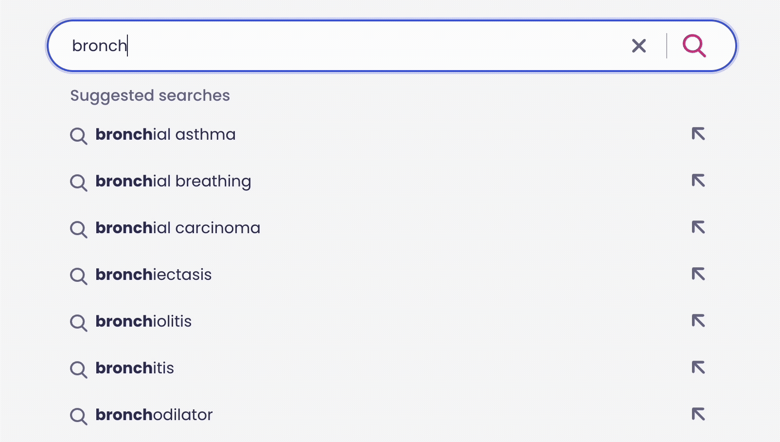
User research underscored the importance of categorisation, but also revealed that the existing UI filters were cumbersome and unintuitive. To address this, I focused on designing a more efficient filtering experience, enabling users to seamlessly toggle between article types. Drawing inspiration from best-in-class platforms like Google, Expedia, and Uniqlo, I combined the most effective elements into a streamlined, healthcare-focused design, infused with the Patient.info design language.
The biggest challenge faced here was understanding how much categorisation users preferred. Given the site’s content-heavy nature, the degree of categorisation could vary widely, risking either overwhelming users or obscuring critical tools through poor discoverability.
To address this, my team engaged in extensive stakeholder collaboration to balance simplicity and functionality, aiming to avoid overcomplicating the UI while ensuring key features remained easily accessible. Through iterative testing and refinement, we prioritised a streamlined interface, shifting complexity to the backend by partnering closely with engineers to enhance the depth and sophistication of the search engine.
Recognising that users were already familiar with Patient.info’s article types, we leveraged this existing mental model by integrating these categories directly into the search filters, creating a seamless and intuitive bridge that encouraged fuller utilisation of the search capabilities. Collaborating with backend engineers, we enhanced the search API to support deep semantic search - enabling queries like “asthma” to return not only direct matches but also related conditions and featured content addressing common user questions, thereby delivering richer, more relevant results.
SKELETON LOADER AND SEARCH ARROWS
User research highlighted a strong preference for intuitive, responsive interactions - something the existing Patient.info experience lacked. Historically, interaction design had not been a core focus, and this was evident through the site's usability.
Through the Patient Design System regeneration project, interaction design became a central focus of my work. I ensured the new search experience embodied a fluid, modern ethos by collaborating closely with engineering to implement skeleton loaders during search result fetches, reducing perceived latency. Additionally, I introduced distinct hover states for both search results and autofill arrows, creating a more responsive, tactile interface that aligned with user expectations for smooth, seamless interactions.
TAGS, IMAGES, PAGINATION
The same design philosophy of clear categorisation was extended to the search results interface. Tag components were introduced and positioned alongside each result, enabling users to quickly identify the type of article, particularly important on Patient.info where content is often split between patient and professional-facing versions. This enhancement was positively received in user testing sessions, as it reduced cognitive load and supported faster decision-making, reducing frustration for users.
Additionally, feature article header images were incorporated beneath the tags to improve visual hierarchy and engagement, while the pagination experience was redesigned to feel more modern and intuitive, contributing to a more cohesive and efficient search experience overall.
TO CONCLUDE,
Redesigning the Patient.info search experience was a pivotal project that deepened my expertise in crafting intuitive, high-performing interaction design - demonstrating how thoughtful UX directly shapes user outcomes in content-heavy digital products. With over 70% of users engaging with the search engine, the project demanded extensive research, user testing, and cross-functional collaboration to ensure the experience was both efficient and seamless.
Post-launch metrics validated the impact I made on this project: 82% of users reported successfully finding the information they needed, and bounce rates decreased by up to 30% in key content areas - clear indicators of improved usability and engagement.